Georgia Tech's Official Bus Tracking App
I redesigned Georgia Tech's official bus tracking app, PassioGo, with UI/UX improvements on features such as route searching, real-time map, and alerts.
Tags
Mobile
Design
Timeline
November 2021
Tools & Stack
Figma
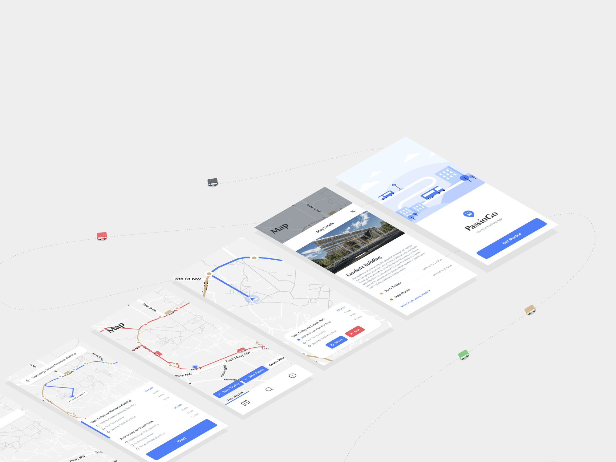
GT's official bus tracking app's current version has design issues when it comes to searching routes, looking up details, following multiple routes in the live map, and more. For a class project, and as a design experiment, I tried redesigning the app. Here's the final version!
Design
Screens
Splash & Start up
From preliminary questioning and observations, students' main motive to use this app is to look up routes from one point to another. The start screen takes users to the search functionality by default, with tabs to a live map and route information.
Search & Navigation
The current app requires users to check different bus routes, their timings, walking distance to bus stops, and make decisions between different options for travel. This process can be simplified by understanding where the user wants to travel.
Routes & Map
Students can look up live locations of buses through easy toggles on a map. Beyond information about the location of bus stops, the app can share more details about the stop such as pictures, significance, and history, allowing students to better discover their campus.
Information & Updates
To plan ahead, students should be able to look up bus timings and route information. The info page wraps such information in a simple UI and also incorporates updates and alerts.
