Workaholic
A platform that encourages healthy behaviour as one sits for long hours in front of their computers / screens.
Tags
UX Design
Development
Timeline
Jan 2021
Tools & Stack
Figma
React
Django
Overview
Problem Statement
From my experience working with tech companies, I realised that employees spend almost 5-8 hours in a day working in front of their screens. This work requires them to be seated for long hours which affects their physical health in terms of eyesight, posture, neck pain, dehydration and headaches. Personally, after a few weeks, I felt a decline in my own health while working in an office. To counter this problem, I spent an hour and developed a simple program that notified me to stand up and walk around according to my schedule. Upon discussing this incident with my peers, I realised that this problem wasn't limited to tech offices. A lot of people now have their daily tasks centered around devices. Moreover, with social media and entertainment through Netflix and YouTube, our devices are designed to be engaging and distracting. As a small step towards building a healthy interaction with our devices, I tried to scale my prototype and design Workaholic.
Note: I do acknowledge that YouTube has a setting that allows people to limit their usage and notifies them when they've been watching continuously. I find it extremely convenient but I'm not sure about the familiarity of such settings among users.
Brainstorming
Features
While considering this problem, I thought what every millennial thinks about any problem — There must be an app for that. Most certainly, I was not wrong. There were several applications I came across, each solving a certain problem about these health issues. Some monitored screen time while some provided tips to improve eyesight. However, two things lacked in most solutions I used. Firstly, I would have needed five different platforms to see insights about my device usage for all the health concerns I raised. Secondly, I felt such applications need to establish a connection with the user to actually help improve their lifestyle. Measuring screen-time on its own is not motivating and lacks the user interaction required.
During the design process for workaholic, I tried to incorporate whatever I learnt from these solutions to build a platform that caters to all these health issues and provides an interaction that feels rewarding.
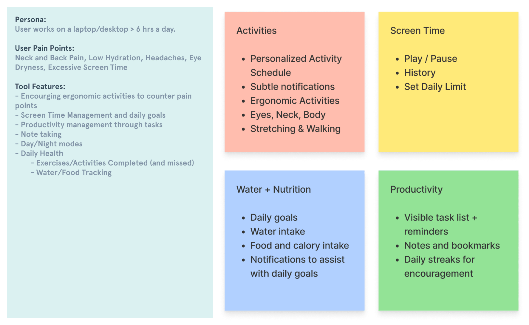
Brainstorming features
Design
Challenges
There are some obvious challenges that this app needs to overcome to fulfill its goal. Deciding the health activities, understanding the user's daily schedule through an interactive and simple onboarding process, making sure there is a limit to the number of interventions in a day — to name a few. Additionally, there were some crucial points evaluated during the process.
Platform?
What type of technology is the most suitable? A software? A web platform? A mobile app or a chrome extension? Envisioning the initial setup that is required everyday was extremely important. I decided that I want to make something that is accessible and accurate. For now, I felt that a software would be too inconvenient and a mobile application alone could not account for a lot of the screen time. Ultimately, I decided a web app supported by a mobile version would be suitable.
Designing subtle notifications
An important consideration besides promoting ergonomic activities is to understand the cues necessary to instruct the person to do an activity. It is also important that these notifications were subtle and were not intrusive or offensive in any manner. They should be instructive enough to help the person understand what to do, and flexible enough to understand the person's priorities.
Keeping the users motivated
It is crucial that the users are motivated to open the app and do these activities. Since productivity apps lack dynamics or instant rewards that motivates users to check these apps, I tried to incorporate some elements of gamification. Users are rewarded by maintaining an everyday streak score along with weekly notifications and graphs to help them realise the efficacy of the application. Additionally, each activity that the user completes gets added to the health tab.
Combining productivity and health
A health application that promotes users to take breaks from their screens must ensure that the user's productivity is not just unaffected, but increased.
Designs
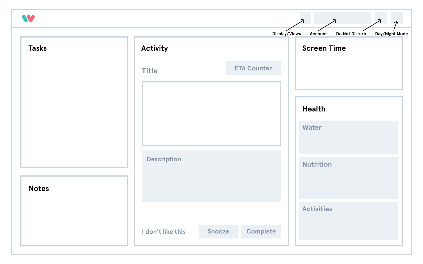
Wireframe
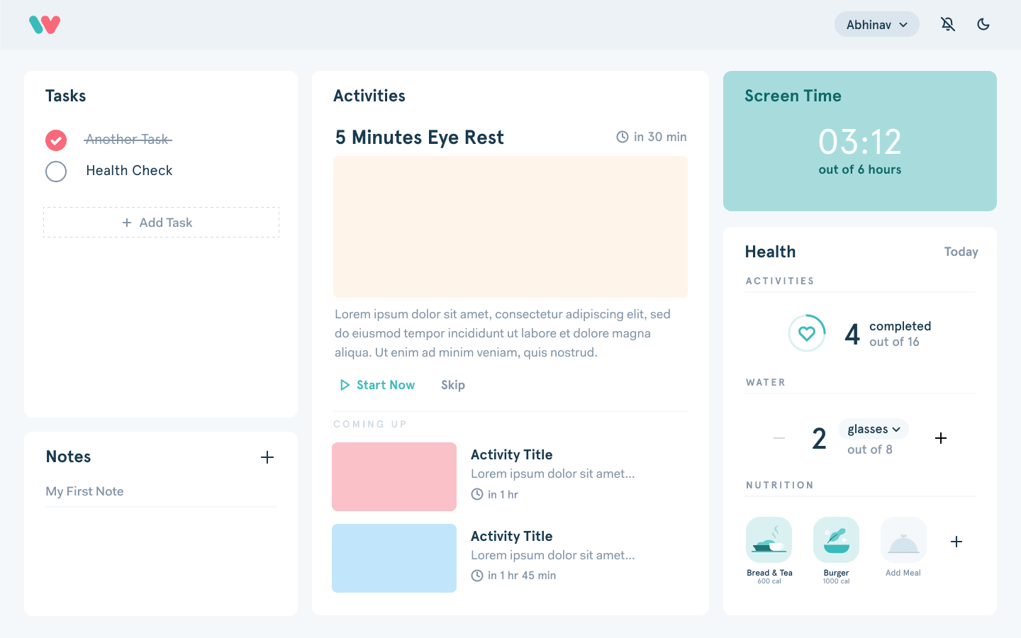
Dashboard
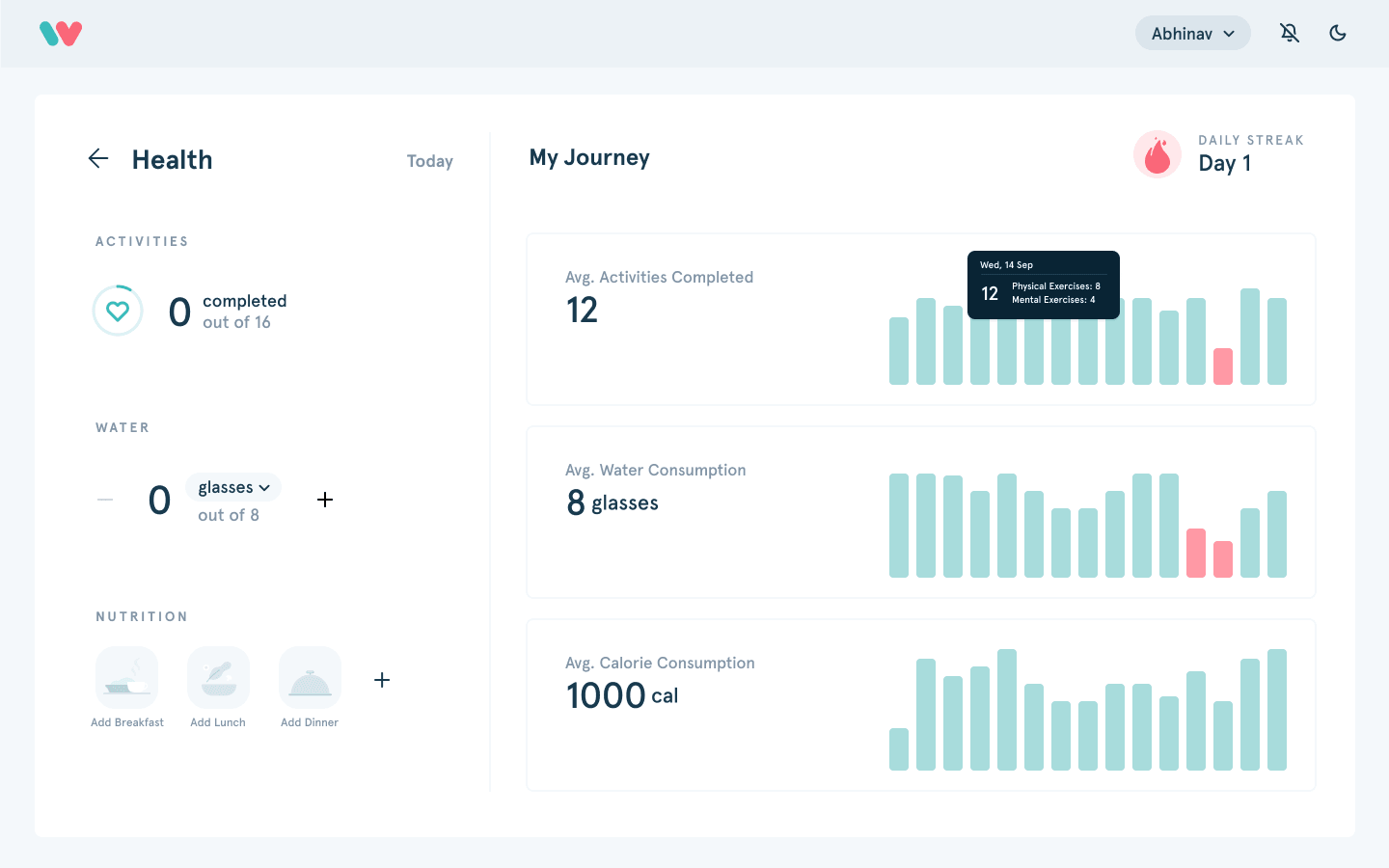
Health: Expanded View
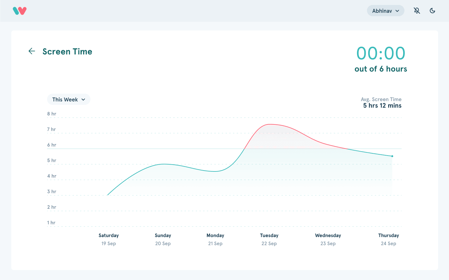
Screen Time: Expanded View
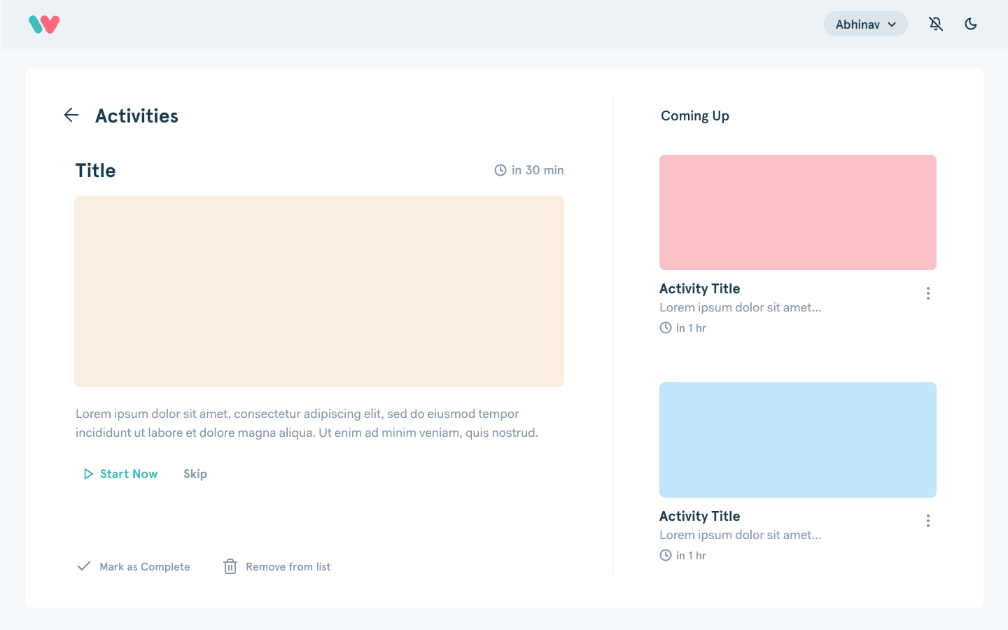
Activites: Expanded View
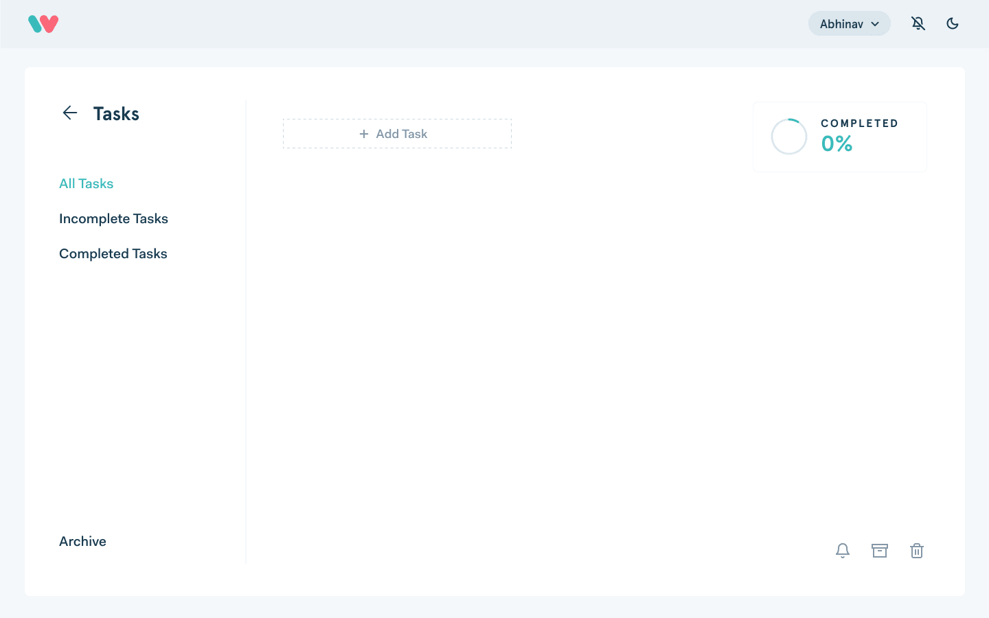
Tasks: Expanded View
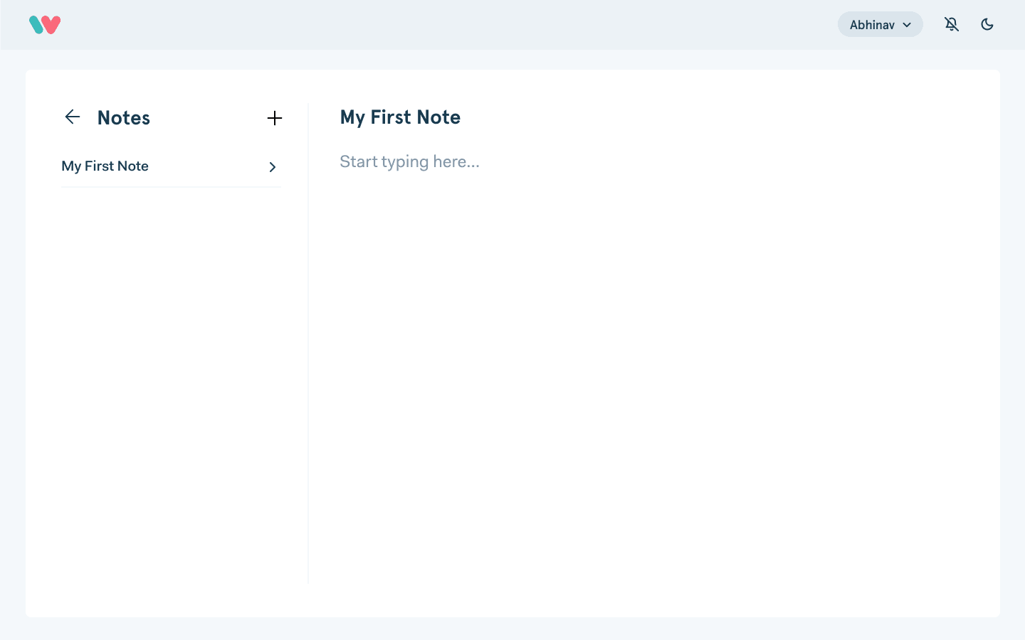
Notes: Expanded View
Development
Prototype
Currently, Workaholic is under development and testing. If you're interested, write to me at thukral.abhinav@gmail.com to learn more.

