Expression
Facilitating the use of smartphone photography to aid psychotherapy at Georgia Tech's Ubiquitous Computing lab.
Tags
Design
Development
Timeline
May 2023
Tools & Stack
Figma
Roles
UX Designer
UX Researcher
Overview
It is well known that millions of people worldwide are affected by mental health conditions and illnesses each year. A short-term method for treating people with mental health conditions such as anxiety, depression, or PTSD is Cognitive Behavioral Therapy, one of several psychotherapy approaches. HCI is increasingly exploring supportive technologies to aid psychotherapy methods such as CBT and several app-based interventions in this space rely on patients documenting and expressing their experiences. Several studies indicate that reflections on these experiences can help patients see themselves as more resilient as they are overcoming adversity.
Visuals and images in this context can act as a better representation of experiences during different stages of therapy. Motivated by these efforts, I was tasked to explore smartphone photography as a method to facilitate positive reflections among patients and to help clinicians provide better treatment.
Problem
How might we use smartphone photography to aid clinician and patient communication in psychotherapy?
Timeline

Research
Understanding requirements
The first phase of the project involved researching the problem space. I start by understanding the space of mental healthcare and psychotherapy by gathering insights about clinician's perspective in the process, as well as understanding patient motivation and problems. This process includes a literature review of research work in the field of technology and psychotherapy and smart phone photography, providing insights about the various methods clinicians employ for treatment. It was followed by a comparative analysis of related apps currently in use that incorporate smartphone photography and deliver support for therapy. After this initial research, I had enough background to create personas in different contexts and presented them to clinicians to understand their perspective, the utility of images, and their process. The user interviews were then followed by a short survey and a mock patient study to understand the patient's perspective. Finally, a set of design requirements were listed and ideated upon for the design phase of the project.
Literature Review
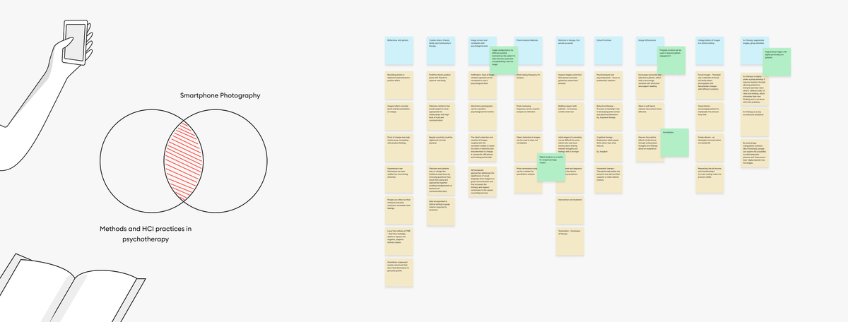
Literature is an essential tool to understand a field like psychotherapy. It is a healthcare discipline with significant depth making it essential to understand how research is conducted around this topic, terms that clinicians use, as well as research questions or concerns that require attention. It also helped provide a framework to think about the stages of therapy that both clinicians and patients go through. I reviewed 15 research papers in this process and analyzed the documents with an affinity diagram. The key takeaways from this method are discussed along with a comparative analysis below.
Comparative Analysis

I looked at three different categories of apps and services in this process. First, there were apps that enabled personal tracking for patients such as PTSD coach, Mindfulness Coach, Insomnia Coach, CBT-i Coach. These apps allow patients to follow a better routine towards their treatment and can act as information hubs for their activities. Second, I compared various apps that use smartphone photography as a medium of communication and self-reflection. This included social media apps like BeReal and Snapchat, as well as features like memories on Google Photos and iOS Photos app. Finally, I also noted popular apps in the space of mental health like BetterHelp that helps connect patients and therapists, and more general meditation/ relaxation apps like Headspace/Calm.
Key Learnings
Understanding patient care programs
There are multiple ways in which patients can receive care depending on the severity of their condition. This can either be in-patient i.e. under medical care or out-patient where the patient frequents visits to the caregiver. The intention here is to focus on out-patient programs where we can facilitate better interaction.
Lack of clinician facing solutions
It was evident with both comparative analysis of existing services and literature review that there is a lack of solutions that help the clinician provide better care. Most solutions face patients and provide care through personal journaling and reporting. I examine how we can utilize the same concepts to help clinicians provide therapy.
Stages of psychotherapy
A key takeaway was the framework that helped categorize various stages of psychotherapy. This allowed me to ask clinicians to reflect on these stages during the user interviews and consider if images would serve as useful artifacts.
Clinical examples of patient behavior
Literature discusses in depth about various mental health conditions along with patient behavior and motivations through various studies. These examples helped describe the personas below and receive feedback from clincians.
Personas and Contexts
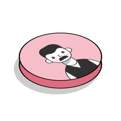


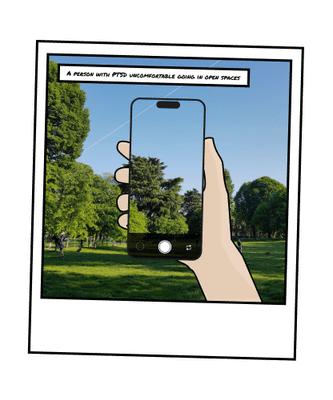
Charlie, 52
He is a war veteran and is now traumatized to go outside in open spaces.
How might they use images?
During his treatment and in the process of getting better, he shares a picture of when he's outside taking a walk in a park.
Context
Exposure to fear
Clinician Perspective
Positive Reinforcement
Moderated Interviews
I conducted interviews with 5 mental health professionals with the following backgrounds:
- Clinician primarily working with PTSD patients
- Therapist primarily working with school students with learning disabilities and depression
- Therapist primarily working with people with anxiety.
- Doctoral Psychology Intern working with children,teens,young adults with autism and ADHD.
- Social Worker in a Community Mental Health Center.
The interviews were semi-structured with asking professionals about their workflow, the most common demographic they serve, methods for informational retrieval/diagnosis, and their experience with technology and therapy. Finally, we also talk about their attitudes towards images, its utility, and reviewed the personas and storyboards created for analysis.
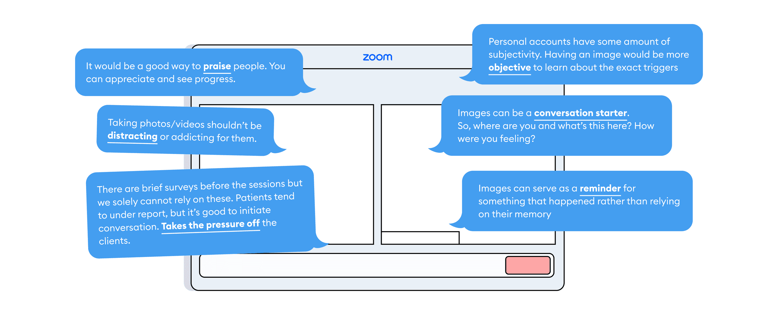
The participants were intrigued about the idea of using photographs to communicate with patients. They spoke about its utility and how they might use images to analyze situations and conditions. The overall feedback on the usefulness of images was positive. Clinicians believed that photos are a great way to start conversations with patients. It can be an entry point for asking them about their day or how they were feeling, as well as a way to objectively look at a situation which is typically narrated. It could also be a way for clinicians to praise patients on the successful completion of activities assigned to them. One concern was that the ask of taking an image should not be distracting for the patient and should not supersede the assigned task.
Survey
A short survey was conducted with 15 respondents between the ages of 23-38. The idea of the survey was to understand a more general perspective on image sharing, what an image may mean to a person, the relevance of photos in the lives of people, ideas to augment expression through photos, and finally some disadvantages of photos.
Respondents shared that images were a way to save memories, keep records, to share experiences with others, and act as visual references in conversation. The results from the survey validated some of the hypothesis regarding the utility of images in therapeutic conversation. People also expressed how images may be harmful in that they can potentially reopen old wounds, and that photos may sometimes lead to bias in the sense that people don't photograph painful moments or struggles.
Design
The Design Process
Following the brainstorming process, I worked on low fidelity designs to capture some of the features of the patient facing and clinician facing interfaces. These included reflections on image activities, reporting mood, and tagging images by the patients, and ways of analysis by the clinician through scrollable images, weekly progress markers, discussion notes. However, the details of the low fidelity were not enough to convey the ideas for appropriate feedback. A lot of verbal explanation to provide details to the participants was not ideal, and hence, a mid-fidelity design was considered.
Design Requirements

Patient facing interface
Based on the design requirements, several ideas were brainstormed and reviewed. An interesting topic discussed in this process was the application of Generative AI to generate pictures from prompts shared by patients. This could be a powerful tool for visualizing abstract emotions felt by the patients and act as another form of communication and art therapy. However, this idea was put on hold due to the open ended potential of Generative AI in the space and the fact that we are dealing with a sensitive user group that requires a more predictable workflow.
Mid-Fidelity Prototypes
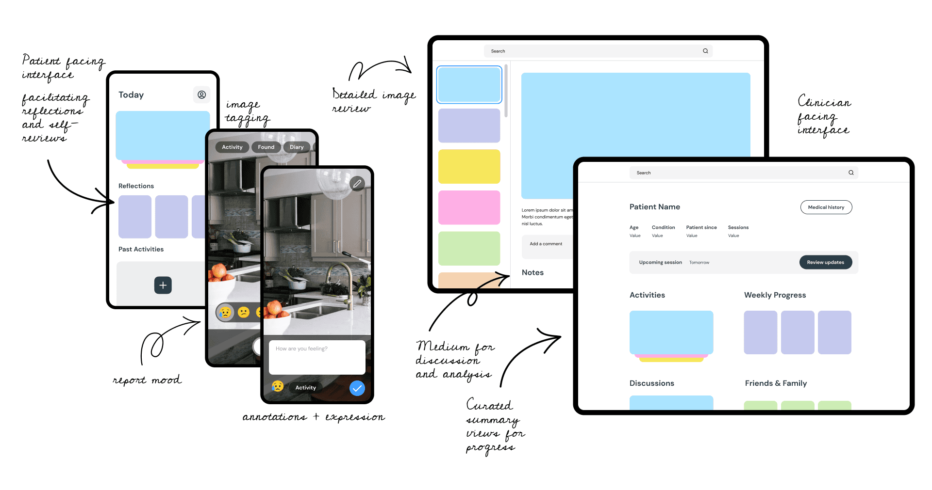
The mid-fidelity designs were successful in capturing ways of analysis by the clinician. Example images proved useful to depict real-life scenarios.
Concept 1: Clinicians can evaluate patient images as journals of their activities as well as categories pictures based on the time of day, similarity, and reported moods.
Concept 2: Various forms of analysis can provide new insights to the clinicians. For example, a patient can feel uneasy during specific hours or the day, or image identification can reveal similar artifacts and patterns.
Concept 3: The clinician can get a better view of each individual photograph with a zoomed in view as depicted below along with the description. The clinician may use this space to share appreciation, comments, as well as save the image and add notes for a later in-person discussion. The designs also a depict a simple version of how appreciated posts will appear as framed images to the patients for positive reinforcement.
Final Designs
Features
Smart Summary
Smart summary of a patient's image activities for the clinician which involves identifying patterns and comparing behavior with past data.
Upcoming Sessions
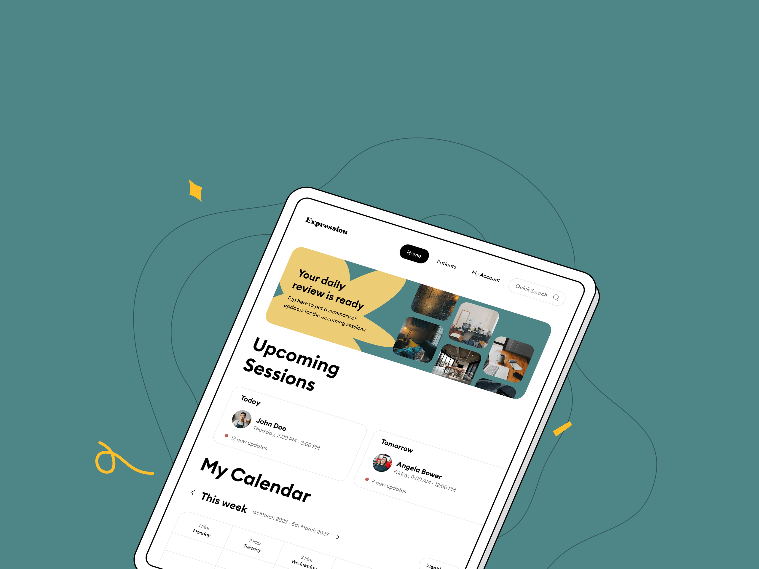
A quick dashboard for the clinician to look at their upcoming sessions and calendar as well as an entry point for their daily review.
Daily Review
Enabling daily review as a way to quickly go over upcoming sessions for the day and a summary for their scheduled report.
Reviewing Progress
Journal-wise view of a patient's shared images organized chronologically to look at progression over time or look at recent updates.
Reviewing Images
Detailed image view with the ability to mark images towards the patient's progress. These marked images can be used by the patients to reflect on their progress and as conversation points for the clinician.
Discussion Notes
For the clinicians that may still like to take the time to prepare specific notes for discussion, the ability to add images in the discussion notes and add personal remarks or thoughts for the in-session experience.
Evaluation
User Studies
The first round of design feedback sessions was through the mid- fidelity designs. Five mental health professionals participated in 30 minute walkthrough sessions. The sessions began with a quick introduction and discussion on the use of images in facilitating communication for psychotherapy. Participants were asked to talk about their thoughts on the screen, what they liked, what they disliked, and the usefulness of the information presented to them. At the end of the session, participants were encouraged to provide overall feedback and raise concerns/questions they might have.
Responses from the participants were transcribed and notes were taken. The overall outlook on the information as well as forms of analysis provided by the images was positive! There were suggestions to add more ways in which images can be tagged. Three main concerns were discovered in this process:
- Two clinicians commented on the time to prepare for the patient being limited and that while this information is useful, it would be harder for them to parse it given the busy schedule.
- They wanted to communicate that the reflection for patients is valuable when the clinicians and patients can meet and talk about the pictures, so the emphasis to improve in-person conversation between the groups was reinforced.
- Clinicians do not want patients to feel like this mode of communication can be a way to call for attention. It should be clear to the patients that the clinicians will only review these activities at a later time in their schedule and that this should not feel like a message alert to the clinician if something is seriously wrong.
Final evaluations
The final evaluation of the high-fidelity design and prototype involved participation from five mental health professionals on tasks centered around exploring the clinician interface. They were then asked to rate the usability and the usefulness of each task in their personal workflow on a scale of 1-5. In terms of usability, we rated the ease of completing a task where 5 refers to a task being easy to understand and 1 being the task most difficult to carry out. For the usefulness evaluation, we looked at how useful a particular task might be with 1 being the least useful and 5 being the most useful. The results were as follows:
- Task 1: Explore the session calendar for an upcoming session
- Task 2: Review an upcoming session
- Task 3: Find and evaluate the smart summary for a patient
- Task 4: Find the set of photos for when the patient reported being sad
- Task 5: Analyze this week's photos shared by the patient
- Task 6: Show appreciation for a photo by identifying it as progress for the patient
Final Thoughts
This project gave me with a lot of learning opportunities. I want to thank my advisor, Dr. Rosa Arriaga, for her constant mentorship and guidance throughout the project. This project would not be possible without her input and support. Here are a few reflections:
Ways of research for a sensitive user group
This project gave me the opportunity to conduct research while dealing with a sensitive topic and research group. When speaking directly with patients proved challenging, understanding their perspective via clinicians and mock studies was a unique learning.
Functional and non-functional requirements of an image token system
While working on a parallel and similar project that involved developing an image sharing system as part of my graduate research work, I also discovered functional and non-functional requirements of such systems. Considerations such as number of images shared, file size of images, storage and privacy are essential factors when designing such systems.
Realizing the depth of seemingly simple systems
While developing a solution for image sharing is seemingly trivial, there are several considerations for its usability and usefulness that are important in the context of psychotherapy.
Managing research input and project schedule
As with any big project, we had a wide range of research inputs gathered and addressed in the design phase. Consolidating all these efforts into a single, cohesive design along with the limitations of a challenging project schedule is a great exercise for prioritization and decision making.
Expression was presented as a project and a poster at Georgia Tech's GVU Center.

