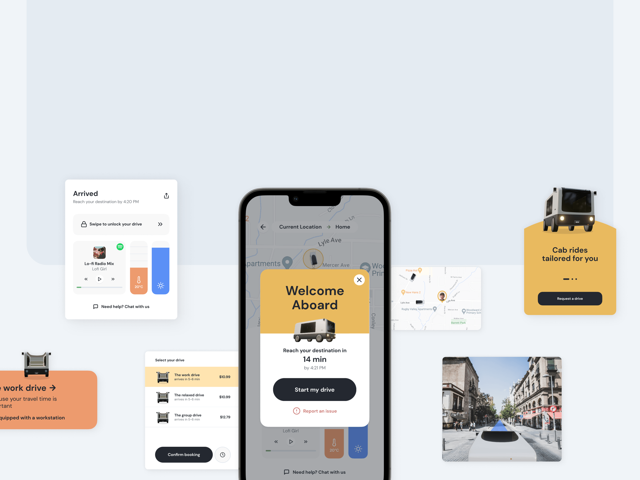
Drive: Rideshare Service
Designing for a concept self-driving rideshare service focusing on comfort and security.
Tags
Design
Mobile
3D
Timeline
Dec 2022
Tools & Stack
Blender
Figma
Team
Abhinav Thukral
Srijan Jhanwar
Overview
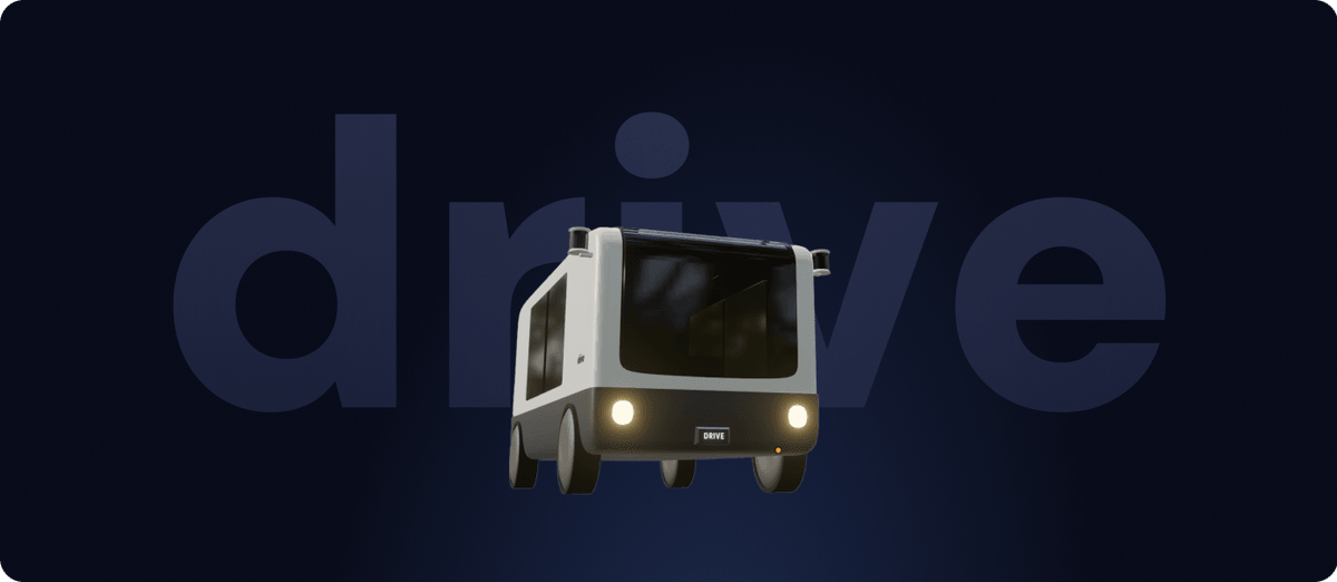
With the 'future of travel' as our prompt, we started looking into autonomous cabs and understanding how ridesharing services like lyft and uber would transform, if all the cabs were autonomous. Given, the lack of a real person controlling your ride and ensuring the safety of the cab and the rider in it - it provides us with an opportunity to fill in the gaps of user requirements of comfort and security when commuting from point A to point B.
Problem
How might we transform the experience of using autonomous cabs, in order to address user concerns and expectations around convenience and security.
Research
Learning about the autonomous space
We started the project with an ecosystem map to understand all the key roles and forces that have an influence on the rider and the service organization. Since the key players in this ecosystem are all technology based, we divided the ecosystem map in three different parts of the jourey i.e. before the ride, during the ride, and after the ride. The key influencing players were then further classified as key players, secondary players and indirect influences.
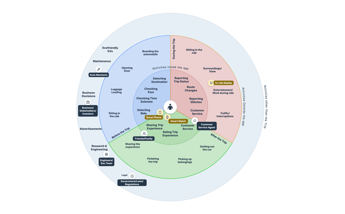
Ecosystem map
Primary Research
We reached out to users with autonomous cars and people who are active in the autonomous transport subreddit. Upon further investigation, we found out that comfort and security is highly subjective among users however, there were some common patterns to what comfort meant for everyone. We identified those patterns and developed a service focused around user's personal needs of comfort when using an autonomous cab. Some of these needs were being able to work/sleep/read during their rides and we developed the project around this innovative service that uses the ten types of innovation framework.
We kicked off our research with some literature review, competitive analysis and secondary online search about automation, current trends, future projections and user feelings around comfort, satisfaction and sense of security with fully autonomous cars and cabs. This initial research was a critical element when formulating our interview script and strategy for the primary research phase with users.
Competitve Analysis
We conducted competitive analysis to understand the current market situation. In order to understand the ecosystem of autonomous vehicles, we used tools like business model canvas, literature review and whitepapers.

Overall, the competitive analysis showed that autonomous ridesharing and vehicles are here to stay, however as any other emerging, upcoming technology, people are skeptical and would not want to be early testers of this tech. There are concerns of safety which are further exacerbated from the reports of the testing phase that these companies are going through.
Since all of these companies have just come out or about to come out with electric fully autonomous vehicles - it provides us with the perfect opportunity to explore this space and identify the disconnect between user expectations of comfort and safety and what the autonomous vehicles/ridesharing services are testing currently.
User Interviews
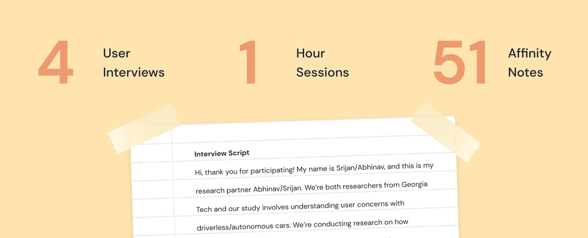
Once we had a fair idea of what the autonomous vehicles ecosystem looked like, we started reaching out to people who had some experience with autonomous vehicles, however recuriting this user group for interviews was difficult due to the several NDAs that prevent them from talking about their experience with any one of the studies/tests that they were a part of for these autonomous vehicles industry. We were able to interview people who had experience with Tesla's driverless feature.
User interviews were a critical part and a pivoting point in our project - we started our project with the intention of improving the experience of the popular ridesharing apps such as lyft and uber however, the user interviews showed that there is no one general solution that can work for everyone.
Comfort and security are both subjective and differ vastly among people with different ranges tech savvyness.
Personas and Journey Maps
Based on all the insights that we gathered from research, we used user personas and user journey maps - both existing and future journey maps - to identify the scope of our work and focus on the problems that required the most attention.
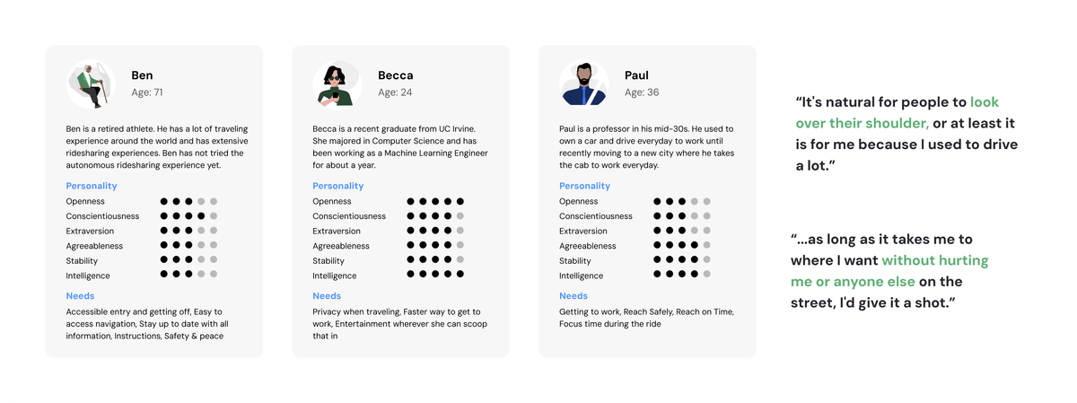
Personas

User journey
Key Opportunities
How might we provide the user with real time information about their surroundings so they feel more secure.
How might we integrate user's expectations and traffic requirements and regulations with transparency.
How might we provide the users with opportunities to make their ride duration more productive.
How might we make the user's journey more secure provided there is no control.
How might we create failsafe for users in case anything goes during the ride and the user needs personal assistance.
How might we better utilize the waiting time and provide the user with a better experience.
Design
The app and in-cab experience
We conducted a whiteboarding session to brainstorm ideas about what this service could potentially feature and how can we create a brand thats unique and simple but also something that people can instantly recognize.

Branding
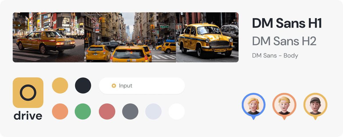
Overall the user experience is very simple and derived purely out of functional requirements. The colors we picked for the visual style guide are derived from the 'typical' yellow and black cabs. We then generated complimentary colors to support different functional requirements in the application.
The selected font is clear and simple complimented with a similar iconography used throughout the application user experience.
The Process

Designing the drive cab
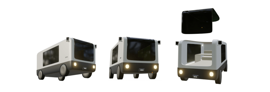
We sketched and generated 3D models of what these vehicles could look like and how we can best present modularity while still allowing for customization of the interior spaces. These customizations were derived from the key insights through user interviews. The most commonly identified drives were - work drive, relax drive, sleep drive and carpool drive. The uniqueness of the physical attributes of the vehicles contributes to the branding and creates an identity for the service.
Design
Features in Action
Scanning Artworks
Visitors can scan an artwork to learn more about it by simply pointing their phone camera towards the artwork. The app would recognize the artwork and offer different insights to the visitor.
Onboarding
Post the first scan, the user can choose to read a quick onboarding guide and browse through different functionalities.
Info Tags
Info tags represent information related to different parts of an artwork that a visitor can learn about in more detail. It allows the visitor to notice small details about the particular artwork and learn about its significance.
Information
With more a detailed information section, visitors can learn about basic details such as era, style, artist, as well as comments from experts such as art professors or museum curators. This section also allows visitors to browse through related artworks present at the High Museum and informs them about how they are related.
Evaluation
User Studies

After completing our high fidelity prototype, we conducted usability tests with our peers in the MS-HCI program to conduct heuristic evaluations. Our initial attempt was to conduct these tests with users who are familiar with the autonomous vehicles/ autnomous ridesharing solutions in the market
We conducted task based usability tests where each task was listed on a spreadsheet and they were judged through the viewfinder of these five important questions:
- Does the user understand how to initiate the task?
- Is the next step noticeable by the user?
- Does the next step match user expectation?
- Does the user know about the progress made?
- Is the user able to complete this task?

Overall, all the tasks were easy for the user to understand and perform. There were a few steps where the user took longer than usual to complete because they were interested in knowing more about the service. In the next iteration we could incorporate informational prompts about what each screen is.
Limitations and Next Steps
Designing for a concept autonomous cab service was a fun learning experience as we peeked at the future possibilities in the world of travel.
The one missed opportunity in this project was being able to interview people who had experience with autonomous ridesharing services. This could potentially lead to richer feedback in terms of functionality and user needs. Despite the challenges of setting interviews with a specific, targetted user group, the process of finding alternative research mediums through reddit and cognitive walkthrough exercises with related user groups turned out successful.
As innovations continue in the space of autonomous cabs, we're excited to observe how dedicated, user-friendly solutions emerge on our roads that overcome the hesitation associated with security and comfort in these spaces.

